
Reader Journey Improvement
What is OverDrive and a title details page?
OverDrive is the largest distributor of digital media to libraries and schools. Their website hosts their complete collection of digital books to search and browse. The title details page is a product description for these books, with context, author, and publisher, as well as a way to get connected to your library or school’s ebook site to access free books.
My Role
- UI Designer II/Strategist
- Quantitative Data/Heatmaps/Analytics
- Research analysis & Strategy
- Prototyping
Additional Team Members
- UX Analyst (Researcher)
- Lead UI Designer
- Front-End Developer
Target Audience
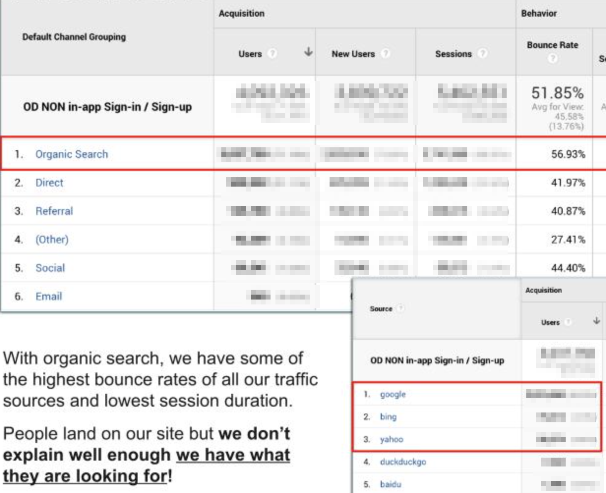
After discovering (through survey data and analytics) new users, particularly organic search traffic unfamiliar with OverDrive, had no idea how to check out a book for free. They expressed frustration when they thought the site was just for reading a sample.
The Initial Goals
- Find pain points, reduce friction
- Get users into one of our reading apps and/or
- Increase library ebook site conversion rates
The Project Ask
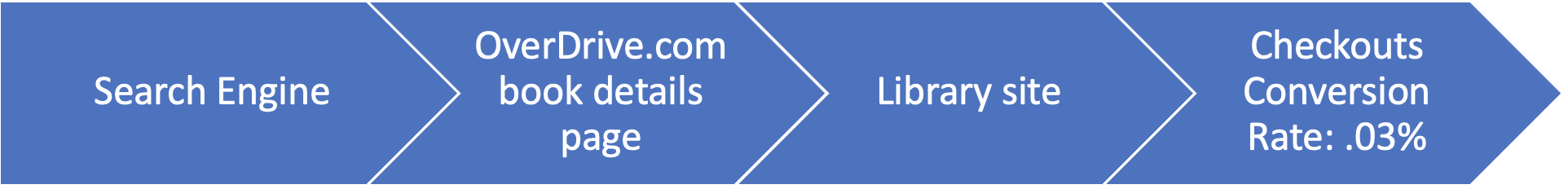
Checkouts from these title detail pages to the library’s ebook site were low. The ask was to increase the number of conversions (book borrows).

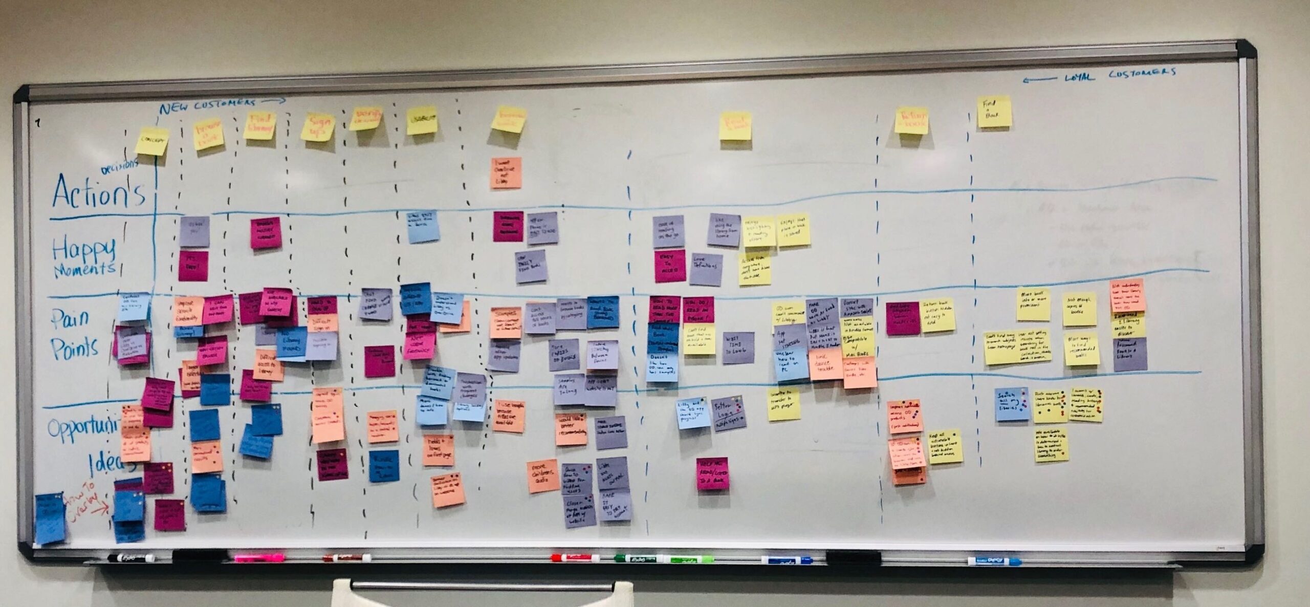
Affinity Diagramming
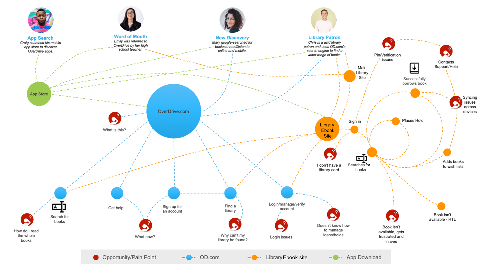
Realizing our users' confusing journey
Biggest Discovery
- Find in your library – “Does that mean I have to go to the physical library to get this book?”
- In libraries nearby – “Again, do I physically have to go to the library to get this ebook?”
- Read a sample – Ok, so I can only read a sample free?
- Sign Up & Sign In – “Maybe if I create an account and get signed in, I can read the whole book free?”
- Available to buy – Wait? I do have to pay?
The answer to all these questions was no.

Since we knew this wasn’t the case, our initial goal was to simplify the title detail page with one clear call-to-action and add information on how the process works.

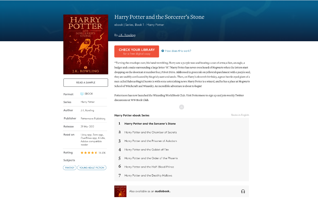
Our Proposed Change
It was not the ideal solution (having to explain how the process works), but it seemed like the only option at the time and we were willing to test it with users before going live.
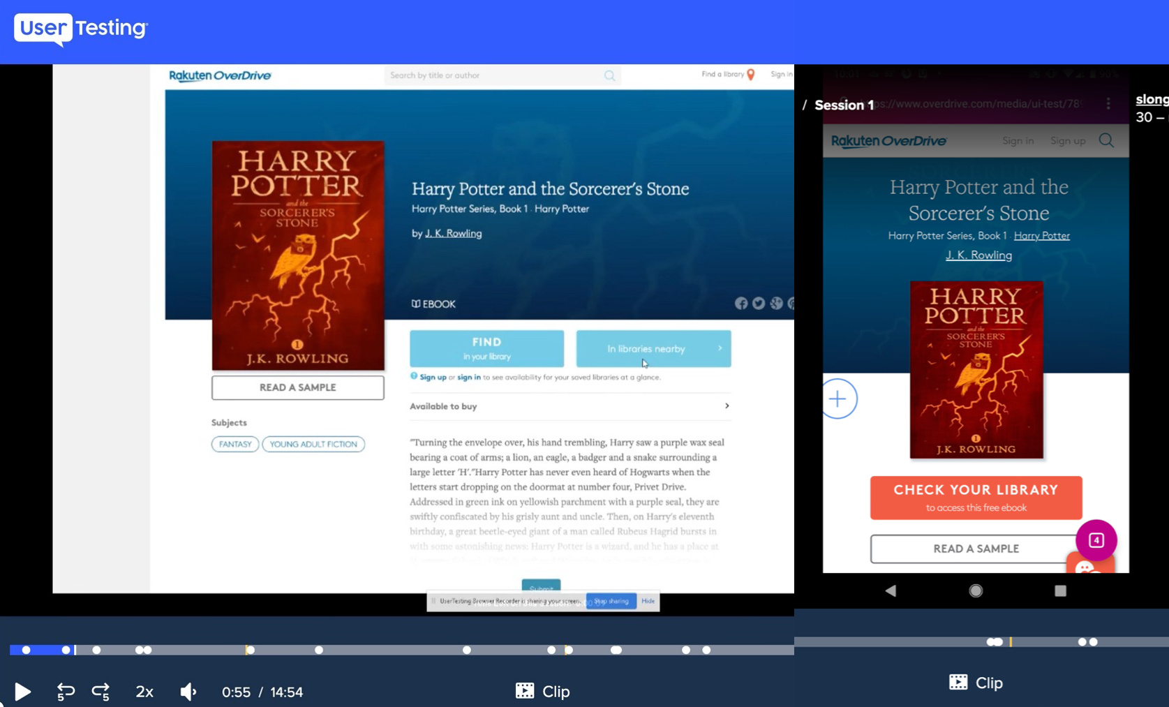
Qualitative Research - Unmoderated Usability testing - UserTesting.com
It was clear the variant version was much simpler and encouraged users to click through more often than the control. Only half of the variant testers used the information icon to learn more.

When we asked participants if they had any questions or concerns to speak aloud, multiple testers said, “Why don’t you just put the list of libraries on the book page instead of making me click through to another page?” *insert mind-blown emoji*
I quickly pivoted our design and did such that.

I took all the components of the “Find in your library page,” including the search field, and condensed it onto the top area of the title details page.
I limited the number of results (with the option to see more) displayed if you happen to live by multiple libraries. I didn’t want to overload the user with too many options or clutter the page.
As of August 2021, the user journey from OverDrive title detail pages to the library ebook sites:
- Book borrows from all traffic sources increased by 59.78%
- Book borrows from organic search traffic alone increased by 77.77%
- Overall conversion rate increased by 250%
Ultimately, more users are accessing free books; the original intent as stated by our site visitors.
Watch me talk about this project!
In this Masters of Conversion webinar from VWO, I discuss the importance of having quantitative and qualitative data to make design decisions and cover this Book Checkout Journey project, as well as the K-12 Resource Center Project.