K-12 Resource Center Landing Page Redesign
What is the Resource Center?
A place for partners of OverDrive to download free marketing materials, view product training and get book recommendations to purchase for their collection.
My Role
- UI Designer II/Strategist
- Quantitative Data/Heatmaps/Analytics
- Research analysis & Strategy
- Wireframing
- Leading Team
Additional Team Members
- UX Analyst (Researcher)
- Lead UI Designer
- Front-End Developer
Project Target Audience
Our main focus for this project was educators and staff in K-12 schools who are partnered with OverDrive and use the Sora reading app.
The Initial Goals
- Get users further into the site
- Increase interactivity and downloads for K-12 users
- Refresh overall design
- Find general areas needing improvement
The Project Ask
Marketing reached out to our team for a design overhaul for the resource center website, starting with the K-12 section of the site.
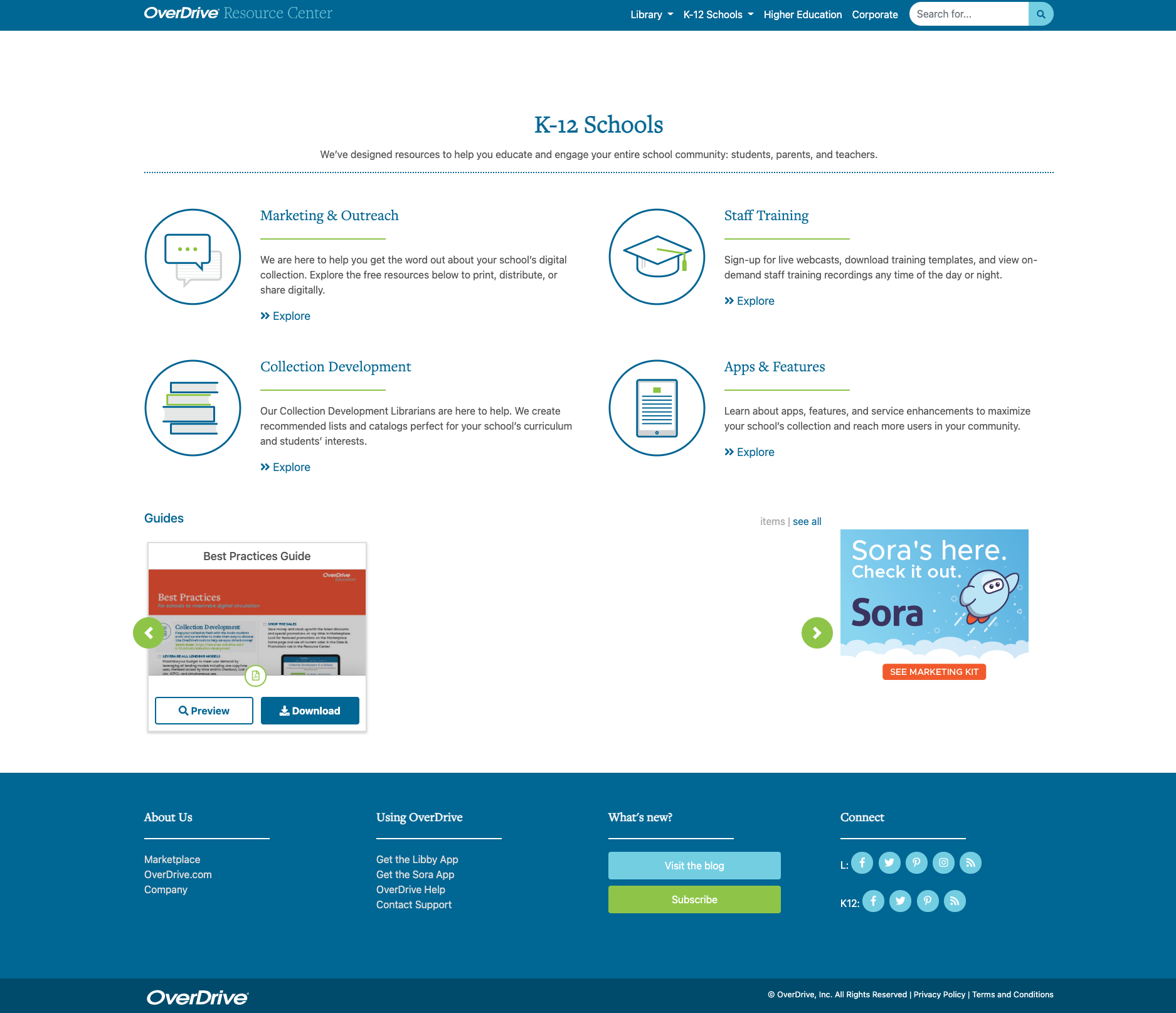
The site styling was outdated and lackluster and marketing was concerned that educators and business owners didn’t interact with the site as much as public librarians.
They wanted us to jazz up the site, make it more interactive/lively and easier for educators to find what they needed.
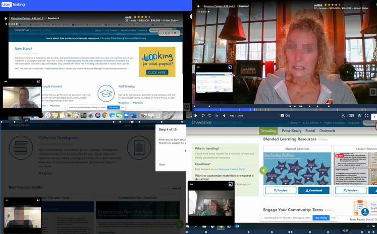
Test subjects:
- In-person and virtual K-12 teachers & staff
- Ages 28-58
- Diverse genders, ethnicities, and economic backgrounds
- Various grades taught and career history
Qualitative Research
Unmoderated Usability Testing – UserTesting.com
We asked testers to:
- Explore the site and think aloud; express their questions and say what they learned from the site
- Complete a task:
- Where would you go to find app information?
- Where would you go to get materials to get students interested in reading?
- Additionally, asked what materials they were interested in and might want to see more of
Findings:
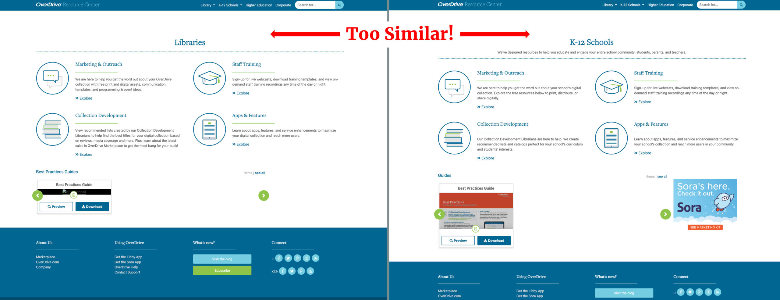
- Testers got lost on the site and often thought the public library section was the school section
- Users struggled to find anything of interest – some of the library naming conventions used didn’t resonate with educators
- Educators loved the existing curriculum support, classroom activities, and book recommendations
- They expressed wanting more app 101s, more white space around downloadable items and materials broken up, especially by grade levels
Key-Takeaways:
- Clearly define industry areas of the site to reduce confusion from K-12 and Library sections
- Rename call to actions and navigation items to wording relevant to teachers.
- Training & app content needs to be more prominent.
- Materials need spaced out and sorted.
Quantitative Research

On-site survey with current Users
Surveyors were asked:
- Reason for their visit
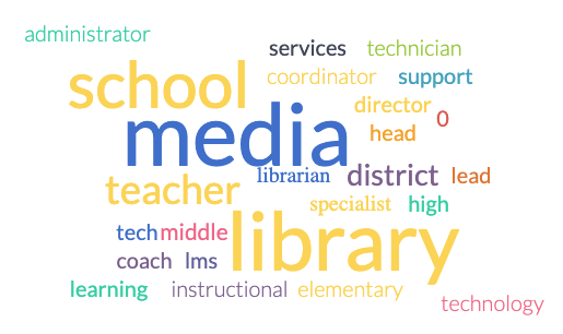
- Their role/title
- What they wanted to promote
- How often they visit the site
- Additional materials or training in which they’d be interested.
Top Content Seeked:
- Watch a training video/webinar
- Find marketing material
- Learn more about the Sora app
- Looking for curated lists
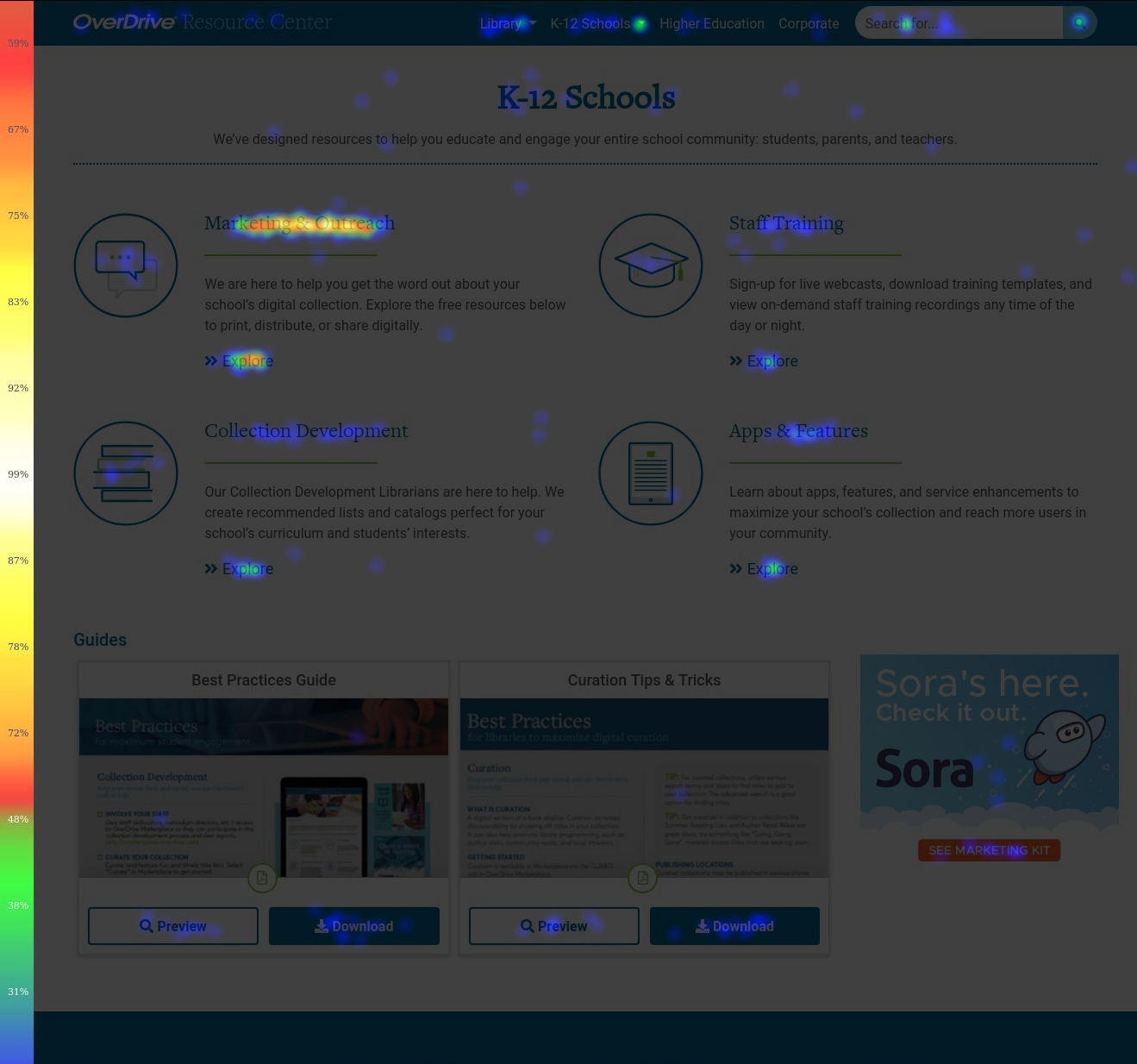
Heatmaps and Analytics with Current Users
We found:
- Most users were coming from the ebook purchasing site or the company website (blog), so they may have had a specific reason in mind for visiting.
- Users were searching for details on Sora, info on shared accounts, help, and “How-To’s.”
- Heatmaps showed users were clicking on marketing material and apps & features the most – but is this where they wanted to be?
Key-Takeaways:
- Sections need clearer labeling
- Promote more training and help resources
Wireframes
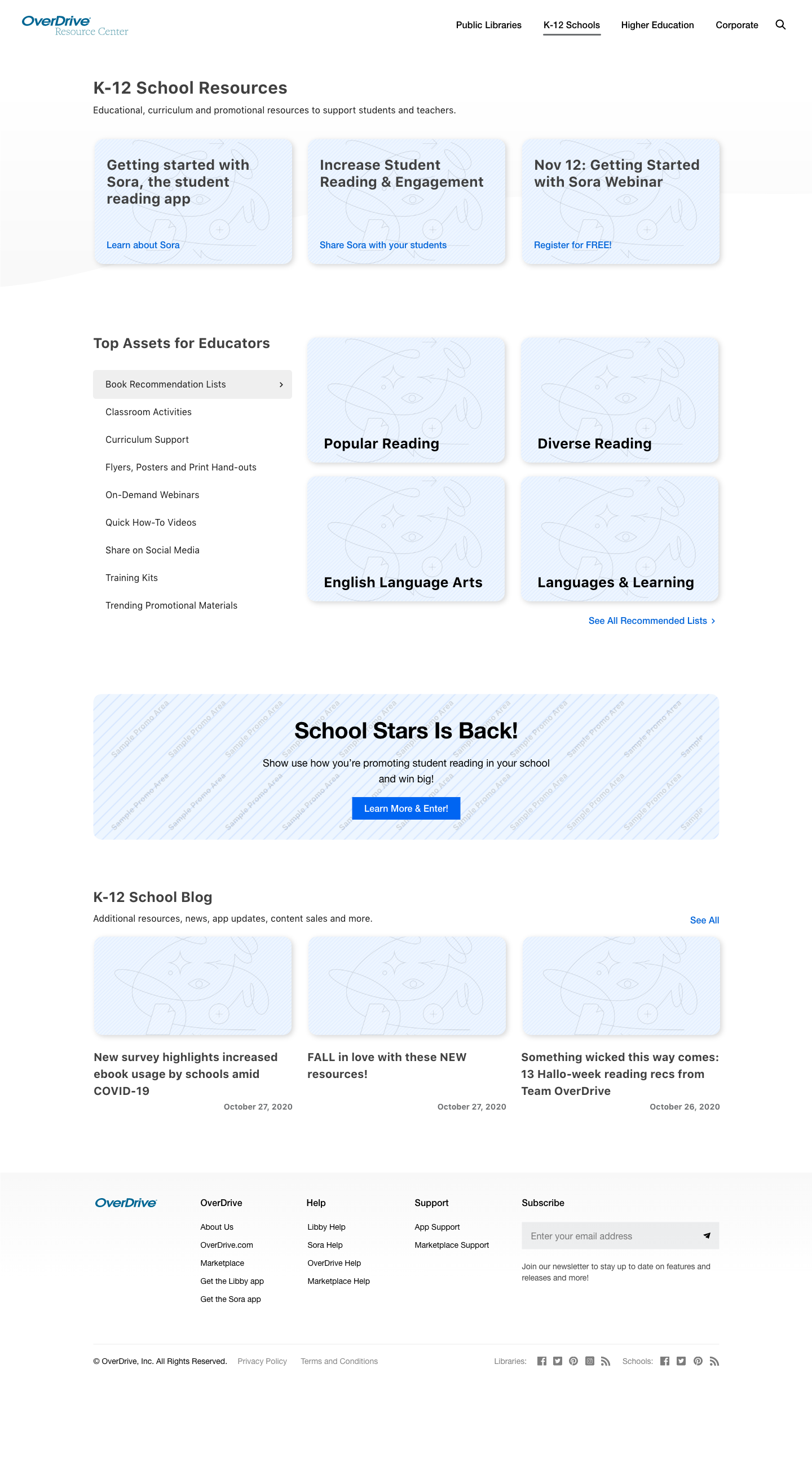
- Laid out and organized content in a way that was easily identifiable with the goal of getting users further into the site
- Renamed elements that made sense for educators
- Sorted categories so users can see on the options available to them
- Whitespace and a lot of added interactivity
Key changes
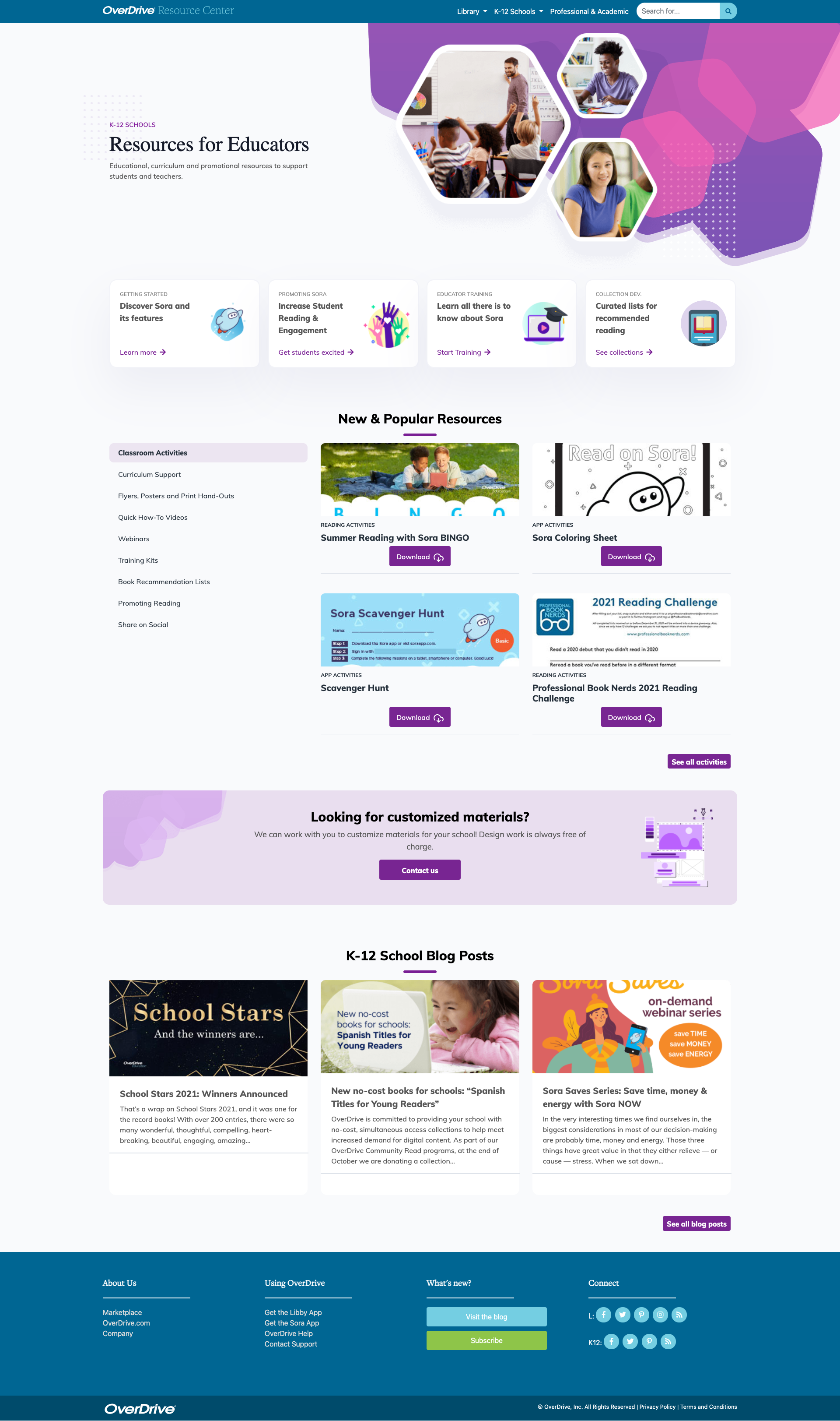
- We organized and identified each industry area of the site by a color scheme:
- Blue for Public Library
- Purple for K-12 Schools
- Green for Corporate/Academic
- Training & app info is more prominent
- Landing page is more vibrant, interactive and shows more content options.
- Call to actions on K-12 page are catered to educators
Watch me talk about this project!
In this Masters of Conversion webinar from VWO, I discuss the importance of having quantitative and qualitative data to make design decisions and cover this Book Checkout Journey project, as well as the K-12 Resource Center Project.

