Design Assignment
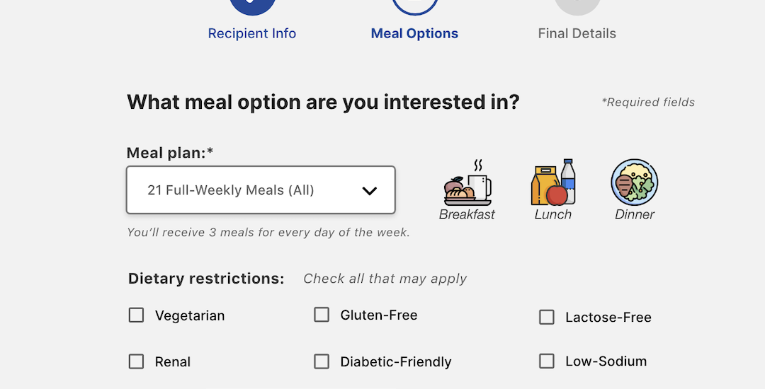
Step 1: Utilize the patterns discussed, as well as critical, user-centered thinking to design (wireframe) a usable interactive form. Annotate and explain rationale.
Step 2: Submit design for group feedback and provide feedback to other’s designs. Engage in discussion to peers.
Step 3: Build on discussions & feedback, and iterate and improve form’s final design.
Project Background
Imagine you are a designer with the municipal government. You must create a form allowing town residents to apply for a meal-on-wheels service.
Required Fields
- Person being served
- Your name (if not the same person)
- Age
- Disabled: Yes or No – If yes, then upload/provide documentation
- Services requested: The meal plan
- Full 21 meals
- Lunch and dinner
- Only dinner
- Which days of the week
- Any additional information about accessing the property
- – i.e., condo gate, phone first, the dog will eat you, etc.
- Notification: how do we reach you
Design the form allowing for all the information listed above. Include annotation to explain any logic or functionality. Include rationale on which patterns or principles you are pulling from to help guide your decision.
Consider the UI/UX patterns and principles: content hierarchy, digital affordances, pliancy, how type and color can support, and other IxD principles we discussed (simplicity, consistency, error prevention, detection, and recovery.)
Research and Direction
My focus was to keep the signup process as streamlined as possible. Goals:
- #1: the user can quickly and easily complete the signup process
- Clean, alignment with helpful hints, and error prevention
- Group-like information and a sensical hierarchy
- Place complex tasks towards the end of the flow (a best practice)
- Ensure only necessary information is collected; make fields optional where possible
- To do so, I conducted a simple competitive analysis to understand current application processes within municipalities and non-profit Meals-on-Wheels websites within the United Sites.
The research found some lengthy registration processes, with over 20 steps and payment requirements upfront. Others were simple contact forms. Some websites didn’t have a signup process online and required either a phone call or going through a social program to start receiving free meals.
Additionally, demographics were analyzed to understand the right persona(s) to fit the narrative of this project. Statistical information was pulled from the national Meals-on-Wheels website and provided a very empathetic background on who this website form needs to serve.
“Nearly 7.4 million seniors have incomes below the poverty line…incomes of $240 a week or less, which, after housing, utility, and medical expenses, leaves very little for food.”
Meals On Wheels
In addition to those research methods, I also applied the best practices and principles for designing web forms, for accessibility and the elderly. Some of the top things considered were:
- Simple, easy-to-read labels (top-left)
- Provide hints or assistive example text for inputs
- Spacing & Alignment
- Button size and placement
- Color contrast
- Font family and size
- Grouped related inputs
- Flow information simple to hardest
- Progress bars (for longer forms) to provide insight and direction
- Clearly labeled Call-to-Action buttons
- Highlight fields with focus states
- Provide more than color for indication of an error (icon)
References (outside of school lectures and reading):
- https://www.toptal.com/designers/ui/ui-design-for-older-adults
- https://www.w3.org/WAI/tips/designing/
- https://www.drip.com/blog/form-design-best-practices
Submissions:
1st Draft – Interactive Form Design Documentation – Submitted January 29, 2023
Providing Peer Feedback – Submitted February 2, 2023
Final Interactive Form Design Documentation – Submitted February 5, 2023

