Design Assignment
Scenario: Redesign a Business-to-Business (B2B) electronic components distribution company homepage. This company sells and delivers a large inventory of components that other companies (manufacturers, retailers, and fabricators) purchase for large-scale use or resale to consumers. While individual consumers can order from the company, it is relatively rare.
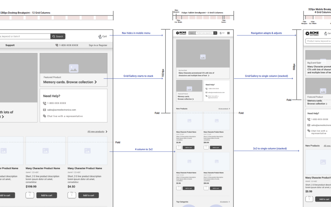
Rethink the responsive layout for the following standard viewports: Desktop (horizontal), Tablet(vertical), and Phone (vertical). Provide feedback to peers’ project draft submissions.
Required Elements
Header Section
- Logo
- Primary Navigation
- Products
- Solutions
- Resources
- Support
- Account Navigation
- Sign In / Sign up links
- Shopping Cart
- Toll Free Phone Number
- Product Search
Content Area
- Featured content area (for features products/sales/events)
- Brief Company intro
- Tech Support / Sales Support Call-Out
- Recent resource (blog) posts
- Recent product additions
- Recent Twitter posts
Footer Section
- Copyright and rights reserved
- Contact Info – Phone, Email, Address
- Social media links: Twitter, Facebook, Youtube
- Newsletter sign up
- Footer Navigation
- Products, Solutions, Resources, Support, My Account, Sitemap
- Site Search
Problems to solve for
Feedback from unfamiliar users:
- The homepage is too cluttered
- Difficult to find what products needed.
- Overwhelming info – cluttered
- Misleading links and pathways
- Many users to give up and try other sites.
For returning and loyal customers:
- Need quicker/cleaner ways to get directly to the products they need.
Goals
Primary
- Get the user to the products and information they need – entice and lead further into the site.
- Reduce bounce rates
- Declutter and reorganize.
- Convert more visitors into product sales.
Secondary
- Provide a space for:
- Featured new products, sales, and events
- Recent articles, how-to content (blog)
- Recent social media activity.
Top considerations and design best practices
- Audience is primarily B2B; focused on quickly ordering and likely in bulk. Finding products and checkout need to be the focus.
- Keeping business goals (conversions) top of mind.
- Content hierarchy and grouped information; what’s essential and valuable for the audience; where does it live?
- Responsive column-grids – number of columns, gutter width, and margin sizes for each breakpoint.
- What will happen at specific breakpoints, and whether the arrangements are truly responsive or if an adaptive layout needs to be considered.
- Plenty of spacing (positive/white space) & alignment to reduce clutter and decrease frustration/overwhelm.
- Accessibility and SEO considerations.
References (outside of school lectures and reading):
Electronic Components
- https://www.avnet.com/ (provided example)
- https://www.digikey.com/ (provided example)
- https://www.mouser.com/ (provided example)
- https://www.parts-express.com/
- https://www.arrow.com/
- https://www.jameco.com/
Design & Responsiveness Ideas
Submissions:
Responsive Interactive Design – Draft – Submitted February 12, 2023
Providing Peer Feedback – Submitted February 16, 2023
Responsive Interface Design – Final – Submitted February 18, 2023

