Week 5
Assignment Due 9/28/22: UXD Principles & Concepts | Masters program
I was once working on a project for my company where conversation rates were low (especially from organic search), and users did not understand how to read a book for free.
Overview: OverDrive.com is a massive catalog of ebooks and audiobooks that one could potentially borrow digitally from their public libraries’ collection. Not all books listed on OverDrive’s website are available at all libraries, but one could check to see if their library has the digital book in their collection and click through to their library site to borrow.
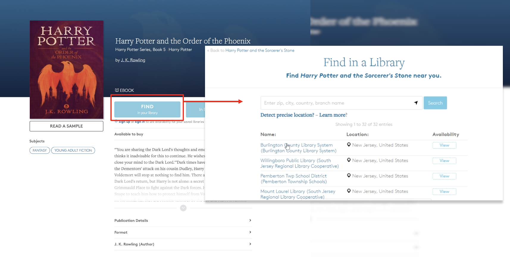
Initially, the title details page (the page that contained the book’s publisher info, synopsis, genre, etc.) had five different calls to action on the top of each page.
- Find in your library (library finder map)
- In libraries nearby (find additional libraries)
- Sign up
- Sign-in
- Read as sample
What we thought was the initial problem.
These 5 CTAs confused new visitors to the site who were unfamiliar with OverDrive and that borrowing digital books from your library was an option.
After running a survey on the site, a UX analyst and I found that users didn’t understand how to get a book. They’d read a sample but didn’t know how to read more. They thought “find in your library” meant they had to go to the library to get the digital book physically. Sign-in/up links didn’t get them into the book as anticipated. Users were stuck.
Initially, we thought, “how could we make it more transparent for users and explain how the borrowing process worked?” After coming up with a few options, we decided to test with users again.
Problems continued
User’s still didn’t understand how to borrow a book for free. Many usability testers expressed that there were (still) too many button options and no explanation on how to borrow books.
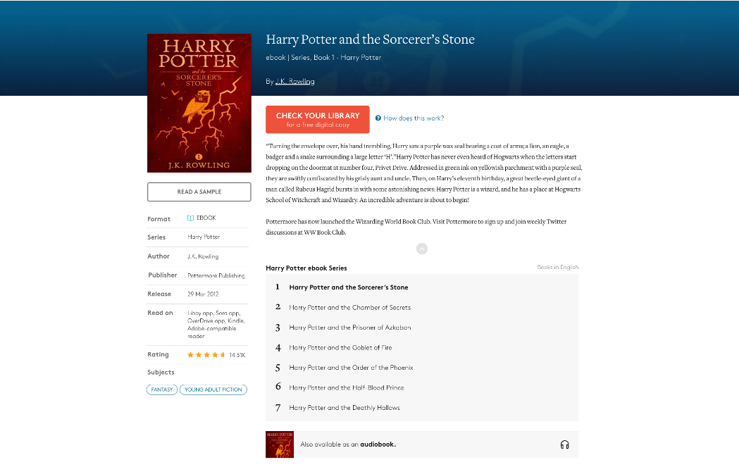
We continued to reframe our thinking: How can we reduce the number of buttons users need to click to find a book from their library? We decided to consolidate all the options (except read a sample) to one button (to take users to the library listings near them that have the book) but also provide an explanation popup for users to learn more.
We thought we had solved the problem. We changed the button color so it stood out and the call-to-action copy to: “Check your library for a FREE digital copy” and usability tested again. Users ignored the question mark next to the button, but they at least were seeing, somewhat understanding, and clicking the new CTA button. But, test subjects still didn’t understand how the books were free – what was the catch?
We recalibrated and added a video popup to trigger when new visitors arrived at the site; stop them in their tracks, and quickly tell them about our company and how libraries offer digital books.
All that did was annoy visitors. We went back to the drawing board again.
Reframing once more
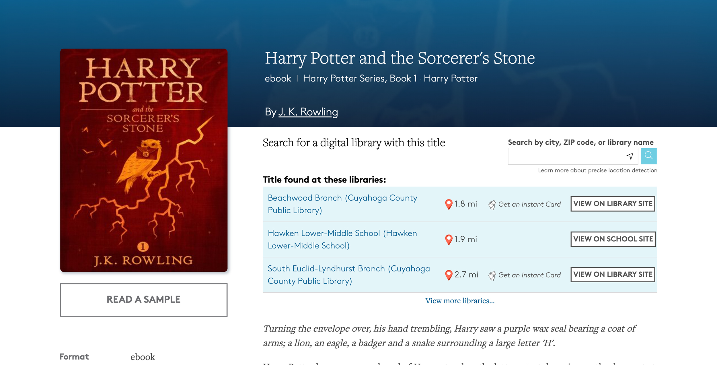
We reviewed analytic data (to see where users dropped off), checked survey answers (again), and did more usability testing. We received a comment from a tester: “I get that I can borrow this from my library, but instead of making me click to see the library listings, why don’t you just show the list on this book details page?”
Typically, users don’t have great ideas on how to solve problems, but this one was our “aha!” moment.
After changing the title details page to have the list of libraries, it became more apparent how one could obtain and read the whole book. Users began clicking through to their library site, and our book borrows increased by nearly 60%.
The detail page(s) still has issues, and I’m continuing to reframe my thinking of the problem and solution(s). But it shows that your first instinct may not be the right solution. Keep reframing, iterating, and improving – there is nothing wrong with getting things wrong the first few times.
Assignment submitted 9/27/2022 by Shannon Kelly.


